Wednesday 27 March 2013

MP - SKYSCAPE - FURTHER ENGAGING 8


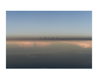
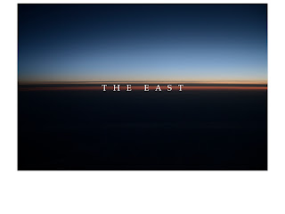
I have changed the font size for a few times to see how it works with the image.  The idea itself to impose a key word onto an image is not new but I just like the feel the text goes together with the image.  Maybe I need to find another idea, however at this moment, I want to test this idea with different options.

I quite like the small fonts, as it gives a sublime feel with the sky image.  Sky is mysterious full of potential and infinity.  The oriental culture believes everything is governed by the sky so it is a sacred object in the culture, but creating smaller text rather than the big ones, could convey this super nature power and mundanity of the human culture.  

Tuesday 26 March 2013

MP - SKYSCAPE - FURTHER ENGAGING 7


Maybe I should change my major project at all.  I see more potential in my sky series.  I am not sure of the composition and the original conceptual development on China issues any more.  Now I am somehow ambiguous and like the sky and the cloud, I keep changing...

Monday 25 March 2013

MP - SKYSCAPE - FURTHER ENGAGING 6


So I embark searching the hot issues in relation to China.  I tried with Internet first, but most of them are current related.  I would like to find something more eternal than this, something everlasting, so I begin to think myself and research in a different arena, stepping away from current affairs.  The words I come across are:

Politics
Dream?
Confucius
Revolution
History
Hyberspace
Communism
Nationality
Identity
Border
Energy
Mortality
Morality
Democracy
Liberation
Heritage
Mythology
Exploitation
Status Quo
Reform
Taoism
…..


Sunday 24 March 2013

MP - SKYSCAPE - FURTHER ENGAGING 5


I thought of a few words and overlaid them on the image to see how it goes.

Same texts, different images.  The China version is strange.  The Identity version is interesting.  I think maybe because the linguistic syntax of China as a word limits the meaning signification, at least for me.  It is a figurative and a thing with a clear item referring to.  Different images and form does not connect with China as a word or signifier well.  However, as Identity is a abstract meaning, by combining the abstract vocabulary with different images, it talks subtly. 

Maybe I should try to create a pool of vocabulary or texts to test further.  Maybe one pool for China related, and one pool for a universal related.  More and more I move away from the initial China related theme, as I think it will be more interesting.


Saturday 23 March 2013

MP - SKYSCAPE - FURTHER ENGAGING 4


I thought of a few words and overlaid them on the image to see how it goes.


Friday 22 March 2013

MP - SKYSCAPE - FURTHER ENGAGING 3


I tried some texts when I did the pilot project presentation and I think none of them are satisfied and I need to hone my idea further.  


I tried some texts when I did the pilot project presentation and I think none of them are satisfied and I need to hone my idea further. 

The original idea is to try some texts from news or Internet to make the image and text work together.  I even thought of letting audience to select anything related to China from wherever, and randomly put together with the image.

It is still interesting, but I want to explore more.


Thursday 21 March 2013

MP - SKYSCAPE - FURTHER ENGAGING 2


The printing quality is unbearable due to my lazy re-sizing approach, so I have to go back to re-edit on the screen.

I am still considering about different composition.  The sky is not split in the middle; maybe in the old classical landscape one third way?  Maybe I can only use a cloud de-contextualising from the sky?

The idea behind the half split is to convey the ancient essence of Chinese thoughts – the doctrine of the mean.  The one third split gives a better sublime affect, it could signifies the mystery or the unknown universal rules of everything better, but I am not sure if it fits to my original idea.  On the other hand, I don’t mind my idea shapes and changes as time goes by.  Struggling to narrow this wide signifier of sky and cloud to something related to China – maybe I am narrow minded in choosing such a topic with such a fantastic subjects, the sky and the cloud.  Should I change my topic completely to something universal?  This has been a key question I have been asking myself time and again.

Then the de-contextualised image of a cloud is interesting itself too. I like cloud, the elusive and the ever changing forms.  Every time I see cloud slowing moving above me, I am looking at an abyss of myself, fascinated by the infinity and the unknown.  Seeing above the cloud is slightly different from seeing from the below, however one thing is unanimously the same is cloud is gorgeous.  On the other hand, I should not be taken away by the form beauty and I should concentrate on the content or idea behind, but how could I get away with it?  I have to quote what Dubuffet said, one of my favourite artist, “Art never comes when you call for it, it never lies in the bed you make for it.”  I can feel it, that art is a by-product, you can never make it as a product, it comes and goes elusively, like love.


Wednesday 20 March 2013

MP - SKYSCAPE - FURTHER ENGAGING 1


The sky series is the least mature.  The edit is yet finished, the text usage is still in the brewing stage, but I have already planned to print it big and hang it epically.  On top of 5-7 images I edited initially, I deliberately included quite a few to expand the visual vocabulary into the this series a little to make an informed final edit. 

The printing is a dissapointment.  I batch resized it to 1800 pixels enough to make a 6x4 but it was a mess, colour and texture of the images are destroyed.  Anyway, I have to made do with it to play around the prints physically on the floor.

I think due to the constraint of the space, I would not be allowed to print and present more than 5 images.  That will make the edit easier, however, deeply in my mind, I would fancy a book with a lot more images, so with these two targets, I have to make a decent selection. 

The key point is the colour saturation and texture, from my perspective.  I don’t want a super colourful sublime image, however I don’t want a grey scale either.  Texture sometimes bother me, as high in the sky, sometimes, well, most of the times, the cloud texture is too realistic, which against my idea to generalise a universal philosophy visually.  Therefore, I tend to choose the images with less texture, with even and smooth ones.  Maybe this way, I get into a narrow tunnel, maybe I should explore beyond.

I will devote some time for text creating and usage specifically.

I envisage 3 images blown big and hang in a linear way on a gallery wall.

Tuesday 12 March 2013

MP - TRANSIT - FURTHER ENGAGING 3


So, I created two separate edits.  One is the night shots and the other one is the day shots.  Unless I come out with good texts, the night shots are not quite making sense.  I think I can only make a selection of 5 images.  Then the day shots are fine.  I prefer the day shots edit, though a point is that I can only find 8 or less ‘satisfied’ images…


Monday 11 March 2013

MP - TRANSIT - FURTHER ENGAGING 2


Re-editing the images, I sort out another strand inside the Transit.  I shot during the darkness at that time, and some of the images created interesting abstract.  I put them together.  Also I juxtapose them with some shots in day time, hoping to create a metaphorical visual narratives.  One night shot, one day shot…  Maybe it is good for a book, but the number of the pages seem not enough...At the beginning is is interesting but then I feel a kind of boring too, as I do not want to create some obvious indoctrination.  I would like to create some signifiers that can slowly blossom in an audience’s mind.  A mundane but interesting one, the more you see the more subtle meaning it can generate…


Sunday 10 March 2013

MP - TRANSIT - FURTHER ENGAGING 1


Transit series probably is the most complex among the three strands. 

Inspired by Shirley, I somehow find a new direction.  With an extreme of distorted blurry, some images created a pictorial presentation.  They are beautiful, with less figurative data on it, which makes the series sophisticated.  It is between the recognisable and the abstract.  I quite like them.  However, at the same time, I should remind myself the formal beauty is dangerous, I have to always put the concept – the content in the supreme position.

The original idea is to make some blurry social documentary with a subjective perspective. The blur was not to make it to an extreme level; the things in the image are kind of obvious though with some ambiguous silhouette.

I shot more than a hundred, however, there are not enough images for me to choose to make a book – thinking a book should consists at least 15 to 20 images.  So I printed dozens after expand my selection.  Printing was the same disappointing – I would never resize to such smaller size for print again.  Especially due to the intrinsic blur, the image quality is very shabby.  Anyway…

There are only limited motif I found out, after laying everything on the floor.  Road, building in construction are the two major ones.  Nature, urban ones are of very limited.  How should I make a good edit with a range of motif is challenging.


On the wall, I would like to make a random presentation with different sizes, however all the shooting was done in landscape, making this random way a little boring, which makes me a little doubtful now.

Tuesday 5 March 2013

MP - MADE IN CHINA - FURTHER ENGAGING 2


The wall layout seems no brainer, and I decided to keep the grid layout.  However, the size of the subject within the image, the position of the subject, and red backdrop saturation needs to be retouched further to the maximum accurate level. 

The idea to make a book seems elusive because there are not enough images.  I envisage at least 20 to 30 images, as I think repeating should be my art strategy for this series.  Shooting for three times, the first time with 54 images, many of which of low definition and the red backdrop is not even.  Second time was not properly done.  Lighting was not set up well hence created some shadows, and I only shot 12 images.  The third time seems good, but only has around 12 good images too.  Then the red backdrop in the 2nd shooting and the 3rd shooting are different, so if I put them into one book, it is a blatant bazaar, well, unless I can come out with a story though.

However, should I try to make a mini red book out of the first shooting?  The first shooting to me was the best as the subjects and images are full of visual data comparing with the second and the third.

Monday 4 March 2013

MP - MADE IN CHINA - FURTHER ENGAGING 1


I need a big space, a wall or a bare floor, so that I can lay out my edits physically, playing around and thinking a little.  I resized some of the images and printed 6 x 4 and tried to work out.  As the end presentation will be on a gallery wall, at least as now I am planning, so I need to juxtapose one another to see the visual effect.

The series Made in China is actually a little straight forward, especially in my mind when I just want to print smaller size, so this way, the shadows projected on the red backdrop would be not that obvious.  However, as I shot three times with different lighting strategy so the colour saturation and visual effect are quite different when they are juxtaposed side by side. 

I made a grid layout.  4 x 3 or 3 x 3 I was a little hesitating but the portrait layout made me decide the 4 x 3 grid, with the last line one missing, creating a further continuation hopefully. 

Two challenges, one is the accuracy of the image layout, how much distance the head is to the border.  It will be very obvious if there is a tiny difference from one image to another.

The other one is that as the second shooting and third shooting are only for a dozen of people, I am facing some potential problem to select 11 images from the same pool.  There would be less options for me, but there will be the wearing, hair style, and other appearance to consider.  I want to create a neutral visual effect, but with less option, I might have to compromise.  Let’s see. 

Sunday 3 March 2013

TAKE A BREAK - GERARD BYRNE @ THE WHITE CHAPEL


I wish I could be there a bit longer as there are quite a few video installations...

Renowned for his films installations which re-enact conversations from specific historic moments, Irish artist Gerard Byrne’s (b. 1969) work explores the way we understand the present through revisiting the past. Always diverse, his subjects have included the Loch Ness monster, the possible location of Samuel Beckett’s play Waiting for Godot and the history of Minimalist art. For this exhibition, Byrne’s investigations range from the politics around sexuality to the production and display of the art object. Premiering in the UK is A man and a woman make love (2012). This multi-screen installation reinterprets discussions about sexuality and eroticism held in the 1920s by the Surrealist group of artists and writers, including André Breton, Jacques Prévert and Yves Tanguy. A thing is a hole in a thing it is not (2010) borrows its title from a statement by sculptor Carl Andre and re-examines seminal moments from 1960s debates around Minimalism.

Saturday 2 March 2013

TAKE A BREAK - THE BIGGER SPLASH @ TATE MODERN


This exhibition will take a new look at the dynamic relationship between performance and painting since 1950. Contrasting key paintings by Jackson Pollock and David Hockney, the exhibition considers two different approaches to the idea of the canvas as an arena in which to act: one gestural, the other one theatrical. The paintings of the Vienna Actionists or the Shooting Pictures of Niki de St Phalle will be re-presented within the performance context that they were made, and juxtaposed with works by artists such as Cindy Sherman or Jack Smith that used the face and body as a surface, often using make-up in work dealing with gender role-play. The exhibition proposes a new way of looking at the work of a number of younger artists whose approach to painting is energised by these diverse historical sources, drawing upon action painting, drag and the idea of the stage set.

Friday 1 March 2013

TAKE A BREAK - THEME COLLAGE @ THE PHOTOGRAPHER'S GALLERY


Laura Letinsky has developed her practice since the late 1990s through meticulously composed still life photographs influenced by 17th Century Renaissance painting. Using a large format camera in a controlled studio environment, her work resembles the aftermath of a meal, where stained tablecloths, spilled wine and squashed, misshapen fruit allude to mortality, frustrated desire and melancholy.
This exhibition focuses on Letinsky’s new series, Ill Form and Void Full (2010-11), and marks a significant development in her work since 2009. Letinsky became increasingly interested in the artificiality of the photograph and its potential as a self-reflexive space. Here Letinsky has begun incorporating paper cut-outs from lifestyle magazines and art reproductions of food and tableware into her studio arrangements.

The series title Ill Form and Void Full continues Letinsky’s interest in playing with representations of space and time, but departs from the narrative potential of the still life. It focuses on the relation between positive and negative space, and a more muted depiction of a subject where two and three dimensional forms from different sources co-exist uneasily.


Geraldo de Barros (1923-1998) is a key figure in Brazilian art and design. His engagement with photography took place during two intensive periods of experimentation at the beginning and end of his diverse career.

De Barros discovered photography as a young painter, and was soon using multiple exposures, camera rotations, over-painting and scratching of negatives to radically abstract his subjects. The resulting series Fotoformas was exhibited at the Museu de Arte de São Paulo in 1950.
De Barros only revisited photography late in life following a series of strokes, when his daughter unearthed a box of negatives from his personal archive. In the last two years of his life he made Sobras (Remains), a final burst of photographic energy which resulted in over 250 intricate collages.
What Remains traces subtle connections across the two series, showing them alongside vintage contact prints and archival material. Together they reveal distinct processes of production, which in turn suggest relationships to his parallel practices as draughtsman, designer, painter and engraver.